KU Homepage Overview
The KU Homepage including full-width image content type is new with the 2017 KU Brand.
There are two layout options available within the content type. Both feature a full-width hero photo and optional call-out text that sits on top of the photo. The layouts for both options are similar, but there are differences.
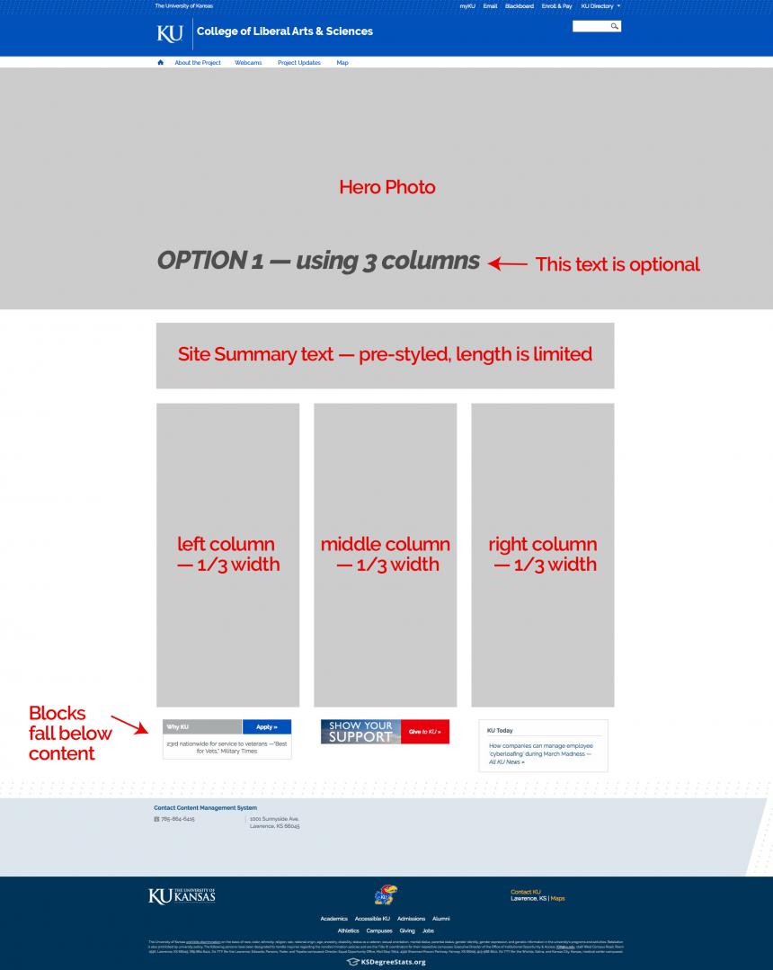
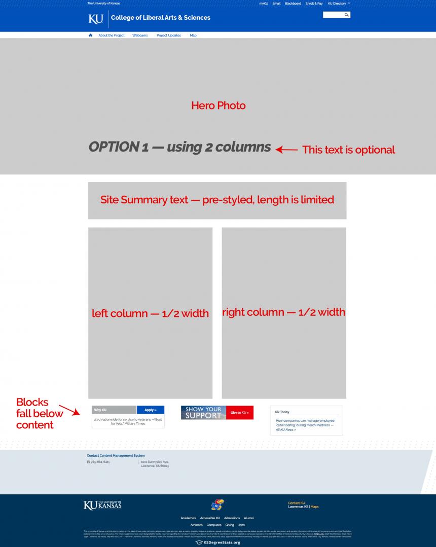
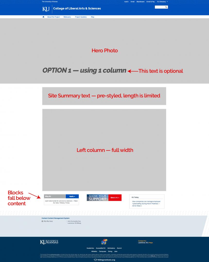
Option 1:
- Features a Site Summary under the hero photo. It is pre-styled with Times at a large font size and the text length is limited. The style is not editable.
- The Site Summary could be a short statement about the purpose of your site, a reason why your program stands out, a brag point etc.
- Below the Site Summary are three column containers. You may choose to populate one, two, or all three columns.
- If you populate only the left column, it fills the full width.
- If you populate the left and middle columns, they both take half the width.
- If you populate all three columns, each take a third of the width.
- All blocks fall below the content.
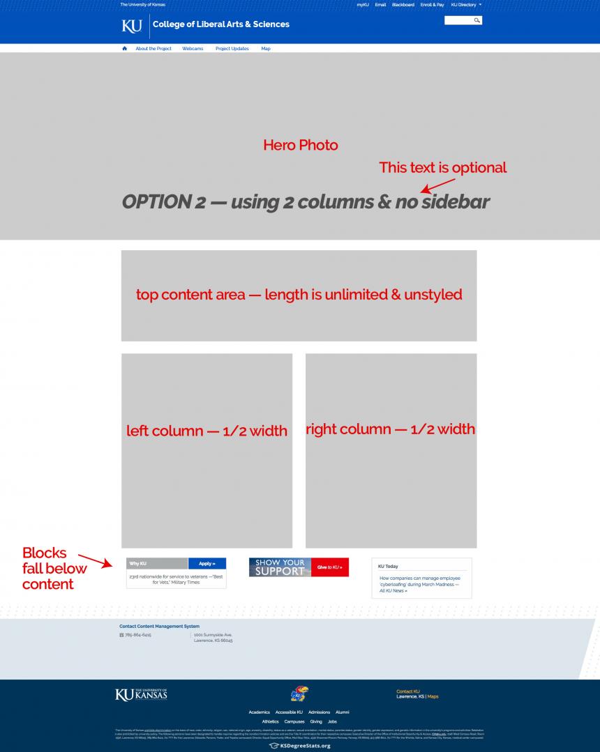
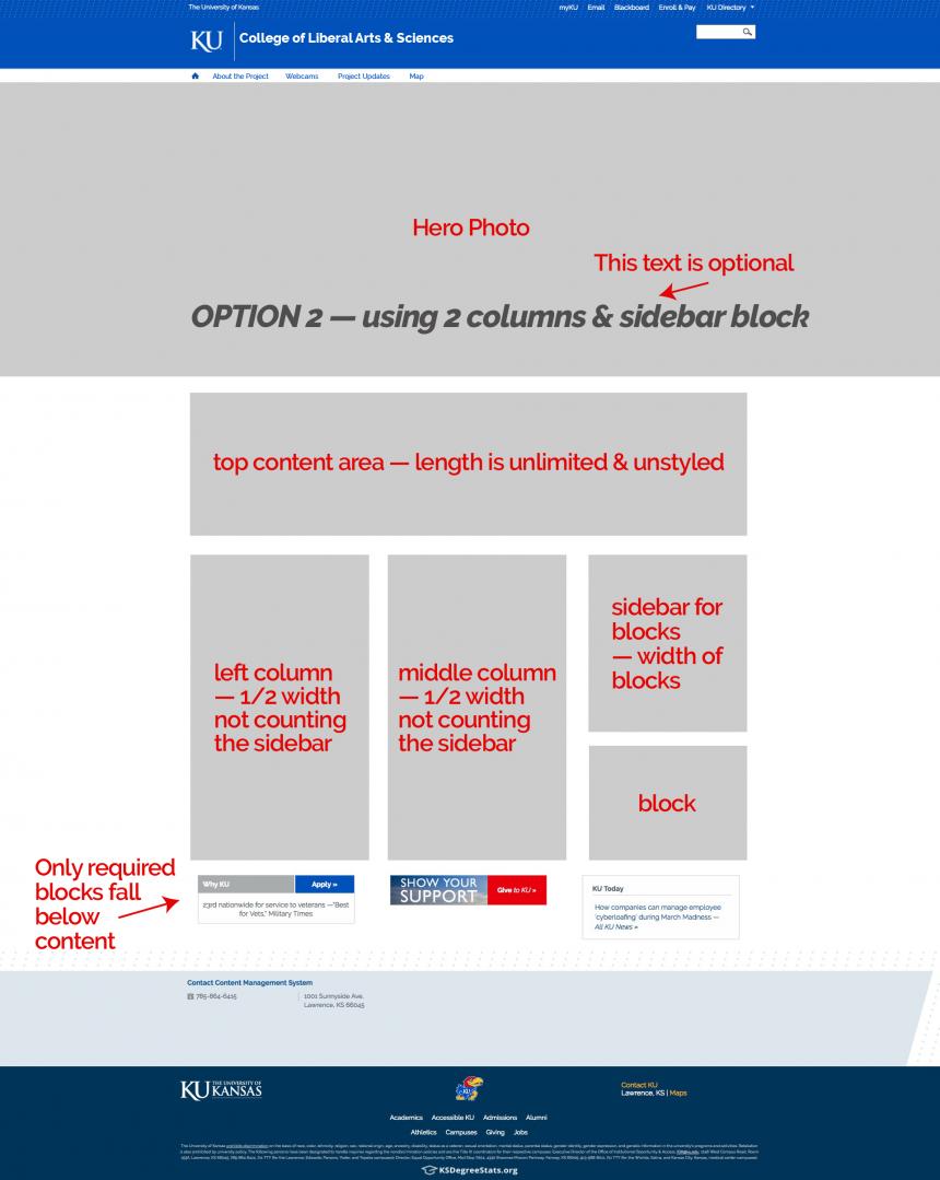
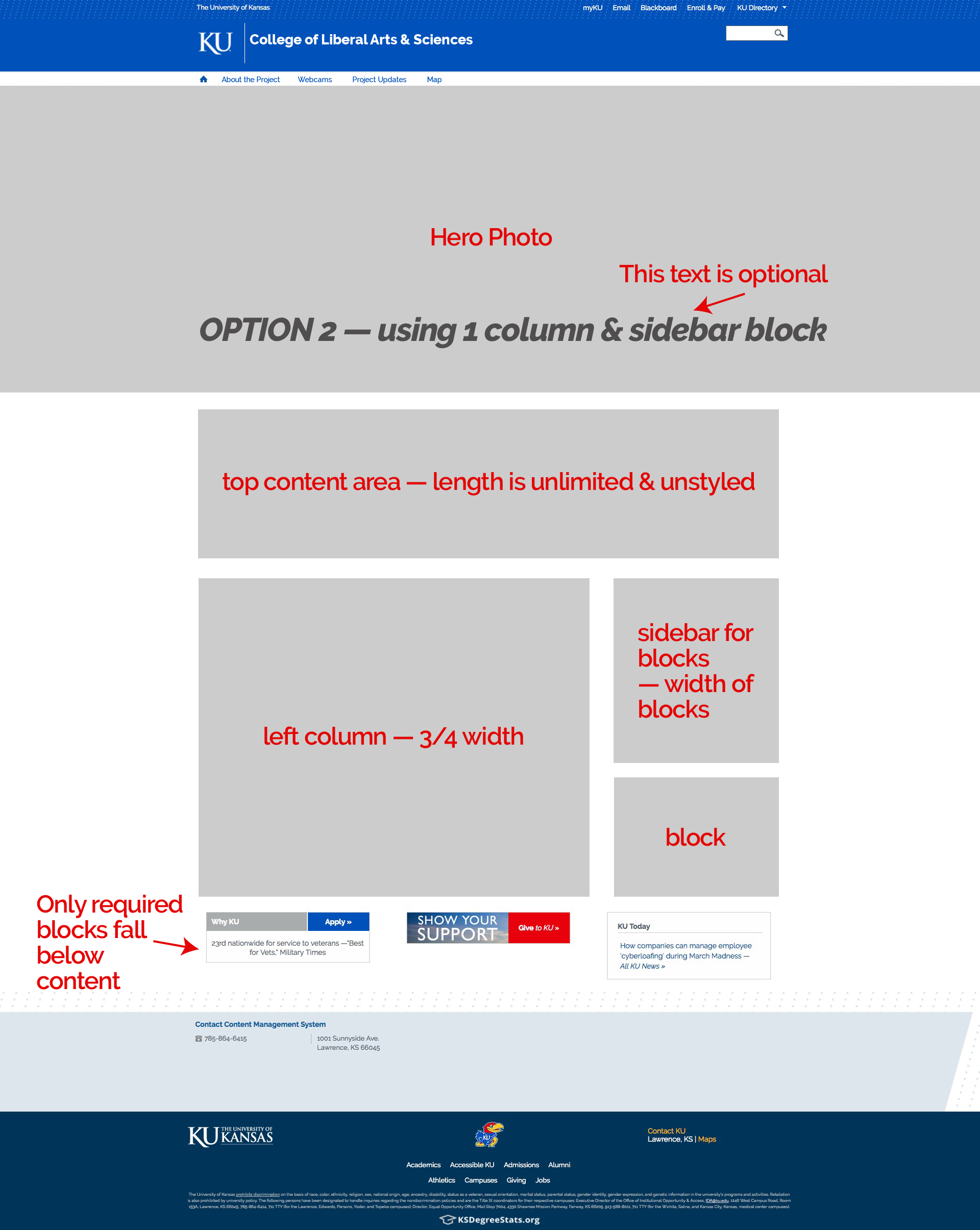
Option 2:
- Features a Top Content Area under the hero photo. It is not pre-styled, length is unlimited and its contents are open.
- Below the Top Content Area are two column containers and a sidebar for blocks. You may choose to populate one, or both columns. The sidebar is optional.
- If you populate only the left column and the sidebar, the column fills 3/4 the width.
- If you populate the left and middle column but don't use the sidebar, each column takes half the width.
- If you populate all three columns, the sidebar is the width of the block and the other two columns divide the remaining space.
- If you populate the sidebar with custom blocks, the required blocks fall below the columns. If you don't use the sidebar all blocks fall below the content.
Option 1 Wireframes:
Option 1 — using 3 columns
Option 1 — using 2 columns
Option 1 — using 1 column
Option 2 Wireframes:
Option 2 — using 2 columns and the sidebar
Option 2 — using 1 column and the sidebar
Option 2 — using 2 columns and no sidebar