Custom Content Type Tutorial
NOTE: You must have Administrator rights to add a custom content type
For the purposes of this tutorial, we will be building a custom content type for Visiting Lecturers. This content type will collect the following types of information:

- Image of Lecturer
- Date and time of lecture(s)
- Location of lecture(s)
- Body
- URL of lecturer's website
In creating this content type we will go over the following:
- Field Collections
- Taxonomies
- Custom Groups and styling
- Date settings
- URL alias patterns
Steps:
- Add New Content Type: Settings
- Manage Fields: Image Field Type
- Manage Fields: Link Field Type
- Manage Fields: Field Collections
- Field Collections: Date Field Type
- Field Collections: Location Term Reference
- Manage Display: Add New Group
- Manage Display: Field Collection Items
- Date and Time Display Settings
- Create Custom URL Alias Pattern for your content type
Add New Content Type: Settings
- Log into your Drupal site as a site administrator
- Go to Structure -> Content Types
- Click on + Add content type
- Here you will be able to give your content type a name. For the purposes of this exercise, we will be calling it "Visiting Lecturers"
- It is recommended to then add a Description to your new content type, but not required. These can be very helpful to users who are not familar with your site.

- Below the Description field, you will notice some vertical tabs beginning with Submission form settings. Here you can rename your Title field label (not recommended) and set if you want to have preview optional, required, or not at all before submitting.

- Next is the Publishing options tab. Here we have a number of choices on how you want the default publishing options to work. By default the following are checked, "Published" and "This is the homepage for the site." Both of these options are not recommended for your custom content type. We will want to save our page as a draft and not have it published by default and we certainly do not want this to overwrite our homepage upon submission either. Instead, we want to save revisions of our page and enable moderation of those revisions (so we can roll it back to a previous version if need be). Finally, we will set the default moderation state to "Draft."

- In the Display settings tab, uncheck the "Display author and date information."
- In the Comment settings tab, we will prevent users of having the ability of commenting on these pages. Therefore, we will be setting the Default comment setting for new content to Closed.

- In the Compare revisions tab, leave the default selections as they are. We want to be able to compare various versions of the page against itself.
- In the Menu settings tab, we can set the default location of these pages within your menu structure. For the purposes of this exercise, we already have a top level navigation item called "Visiting Lecturers" and we would like all new content built with this content type to automatically be a child of that menu item. To do that we make sure that Main menu is checked and then select Visiting Lecturers in the Default parent item drop down menu.

- In the XML sitemap tab, it defaults to "Excluded." What this means is that the pages created using this content type will not be added to your sitemap that you have submitted to Google. In this instance, we want it included and have the priority set to normal.

- The final tab is the Scheduler. Here you can enable it so that your users can schedule dates and times for when this particular page will be published or unpublished. We are not going to enable either this for this content type.
- Now that we have all the settings the way we want them, click on the Save and add fields button and we will begin to add fields to our content type.
Manage Fields: Image Field Type
- By default, you will see a number of fields already provided for you. These are all fields that we will be using, we just need to add a few more.

- For our Visiting Lecturers content type, we want to give our users the ability to easily add an image to the page. In order to do that, we will need to add an image field. In the Add new field area, enter in the label for your new field — in this case "Image" —-- and then select Image in the Field Type drop down menu and then click the Save button

If another content type already has an "Image" field, then the Machine Name most likely will already be in use and Drupal will alert you. You can edit your new Image field's machine name, without having to change your label, to get around that error.

- We can now update the Field Settings for our new Image field. You can set a default image for your content type if one is not available when the user is posting. This is handy so that it does not break your design by having some with images and some without. If you choose to use a default image, select it, upload it, and then click the Save field settings button.

- We can now add more settings to this field. We can do the following:
- We can make it a required field — If you already have a default image, you may not need to make it required.
- Add some Help text — Text that you can use to explain what this field is intended to be used for in your content type.
- Define the Allowed file extensions — Recommend leaving the defaults.
- Specify the File directory -- For where the images uploaded via this content type will be stored.
- Set your minimum and maximum image resolution — While you can manipulate how your images will be displayed via CSS, it is a good idea to set these if you want to have consistent width and height on your images.
- Set maximum upload size — If you do not set your maximum image resolution, this would help to ensure that your page will not be slowed down by loading huge images.
- Enable the Alt field — Highly recommend it to ensure that our content type is ADA compliant.
- After you have saved all of your settings for the image field, we can now move it. We want the image field to appear directly after the Title field, so you can click and drag the cross-hair icon next to Image and drag it to where you want it to go. Once you have done that, click on the Save button.

Manage Fields: Link Field Type
- In order to create a field for a website for the Visiting Lecturers content type, we will be following some similar steps as we did when we created the image field type. We will once again go to Add new field and enter in the label we want to use, but this time we will select Link for our Field Type and click Save.

- We have some familiar options like required field and help text, but also some specific settings specific to the Link field type. For instance, you can have the URL validated before it is submitted, you can specify the Link Title for this field, and even add additional CSS class to that link if you want to style the link in a special way.

Manage Fields: Field Collections
- In our example of a Visiting Lecturer content type, we want to have the flexibility of adding multiple dates, times, and locations to the content type. While we could just create a set number of fields, that can be cumbersome. Instead we can use Field Collections that will allow us to only have the number of fields that we need. Need to add another date, time, and location for the Visiting Lecturer? Just click on the Add another item in your completed content type, and you will have another collection of fields to fill out.

- To create a Field Collection, we need to do the following. Go to Add new field, update the Label (it is best to be descriptive if possible), select Field collection from the Field Type drop down menu, select Embedded in the Widget drop down menu, and finally, click Save.

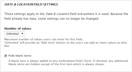
- On the Field Settings tab, keep the Hide blank items checked and click Save field settings.
- You can then add some help text if needed and at the bottom, set the Number of values. What this value does is allow you to allow only a certain number of dates and locations added to your content type. For this exercise, we are setting it to unlimited.
- As you can see, the Date & Location field collection is just one line in our content type. How can we define the settings for the separate date and location fields? To do that we have to go to Field Collections by going to Structure -> Field Collections. Drupal treats them like their own separate content type. By adding the field collection in our content type like we did above, it will also add it to the Field Collections page for us to add to and edit.
Field Collections: Date Field Type
- Upon going to Structure -> Field Collections, you will see the field collection we created in the previous step. Click on Manage Fields for the field collection used in our new content type.

- This should look familiar to you now. To add a date field, go to Add new field, enter in your label, edit the machine name if needed, select Date from the Field Type drop down menu, and in the Widget drop down select Pop-up calendar and click Save.

- You will now be able to set some specific settings for this Date field.
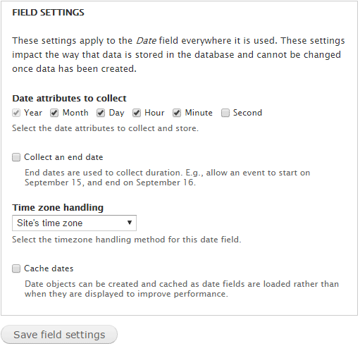
- After saving the field settings, once again you can make it required, add help text, but also do some More Settings and Values associated with date fields. By clicking on that accordion, we can specify the form we want the date and time to be entered, how far back we want to allow the user to go back, how far into the future they can go, time increments, and set the default date.

- Click Save and now we are ready to add the location field to our field collection.
Field Collections: Location Term Reference
- We now need another field in our field collection, this time for Location. We will once again go to Add new field and enter in the label we want to use, but this time we will select Term reference for our Field Type and Autocomplete term widget (tagging) in the widget drop down menu.

We could use just make it a text field type, but am electing to use term reference so that we can record all locations entered into this location field into its own taxonomy. You can think of this as its own table that just stores the location information that user's have entered through your content type that can then be used as suggestions when filling out the location field in your content type the next time you used it. For instance, if you started to enter in "10" in the location field, since we have it set to Autocomplete, it will look at that taxonomy table and find all locations it has that have "10" in them and suggest them to you below.

- After you added your new term reference field for location, it will take you to the Field Settings section and ask you to select the Vocabulary which supplies the options for your location field. What it is really asking you is what Taxonomy are you going to use. You can select an existing one or you may want to create a new one to use for this field. To create a new one, got Structure -> Taxonomy and then click on the + Add vocabulary link. Now we can create the taxonomy. Enter in the Name and click Save.

- Now go back to your field collection (if you have it open in another tab, you can just refresh the page) and edit the location field and in the Field Settings section of either the Edit tab or the Field Settings tab, select the new taxonomy we just created.

-
We now have all of the fields we need for our custom content type. Now we just need to organize and style them.
Manage Display: Add New Group
- Congratulations, you have created a custom content type. It is collecting all the information you want, but odds are it is not looking the way you want. At this point you can test it out by going to Add content and selecting the new content type. Let's try it out. At this point, this is what you will get.

- So many issues... Ideally, this is what we are shooting for.

- Go back into your content type (Structure -> Content Types) and click on Manage Display for your content type so we can begin to clean it up. On the Manage Display tab you will notice the order is a little out of whack. It is important to note that the order of the fields in the Manage Fields tab only affect the order of the fields when you add new content. The order of the fields in the Manage Display tab relate to the order the fields are displayed after that content has been published using your new content type. Therefore, click and drag the fields into the order you want them to be in.
You will notice that in the image from step 1 that all of the fields, but the Body field, are labeled. Let's get rid of that. Change all the labels to <Hidden> in the label drop down menus for all fields, reorder the fields if necessary, and then click on Save.

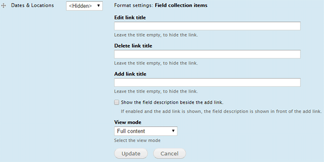
- Next we want to get rid of the Edit, Delete, and Add links that are appearing. Those are created with our field collection for Dates & Locations. To remove those, click on the gear icon on the Dates & Locations row.

- You can now remove the Edit, Delete, and Add link titles by removing the text from those fields and then click Update.
- Now that we have removed the flotsam and jetsam, let's group the areas so that we have a left column that will contain the image and a right column for everything else. Under Add new group enter in a label, group name and set the format to Div. You can then click and drag it to where you want it to be. Since this is the left column that will contain the Image field, put it above the Image field and then make the Image field a child of the Left Column div and click Save.

Now everything nested under the Left Column div will be wrapped in a special div with a class of "group_left_col" that can then be used as a hook for your CSS for styling.
- Do the same for Right Column.

- By default Drupal will add some interesting treatments to your div — for the purposes of this excerise, we do not want them. Therefore, like in step 4, we will be clicking on the gear icon for the Left Column and the Right Column and change those settings. We do not want the div to act like an accordion, so we will set the Fieldgroup settings to open. We do not want a label to announce to the world that this is a "Left Column," so we will change Show label to No. While we can use "group_left_col" as a class in our CSS for styling, you have the option to add an additional one here as well. This is helpful if you already have a class created in your CSS already. Click Update.

Then do the same for the Right Column and click Update.
- Next up, managing the display for the fields we created in our field collection that is storing the Dates & Locations.
Manage Display: Field Collection Items
- Let's test our content type out again by adding content into our custom Visiting Lecturers content type. Please note, that changes made to the content type after pages have already been created with that content type will not show those changes, hence the reason we are creating a new one.

This example will display differently for you, as I already had some styles set for the group_left_col and group_right_col divs.
.group_left_col { float: left; width: 230px; }

	.group_right_col { float: left; width: 590px;}

	.group_left_col img { padding: 3px; border: 1px solid #ccc; margin: 0 1em 1em 0; }

	.field-name-field-website-lecturer { margin-top: 1em; }
The above CSS is only good for wider desktop resolutions. Additional styling using media-queries will be needed to give it a better, more consistent user experience in smaller browser windows and mobile devices.
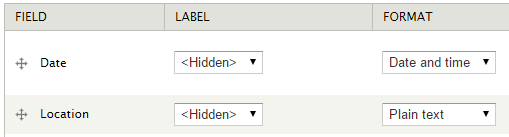
- As you can see, we have field labels appearing in our field collection above both the date and the location fields and our location is a link. To remove those, go to your field collection (Structure -> Field Collections) and then click on manage display for the field collection used in our custom content type.
- To remove the label header, set the label drop down to <Hidden> and for the Location field, change the format drop down to Plain text and then click Save.
- Next we will change the way the date and time are displayed.
Date and Time Display Settings
- Having the day of the week and military time may be fine, but we can control that as well. In order to do that we can click on the gear icon for our Date field in the Manage Display tab in our field collection.

- Now under Format, you can Choose how users view dates and times. However, we have limited options.

- If none of those options float your boat, click on the Date and time settings link below the drop down. This will take you to the Date and Time page (also found Configuration -> Regional and language -> Date and time). By default we have the Long, Medium, and Short options. To create a new one click on + Add date type link and then name your new date type and select the format you want from the drop down menu and click Add date type.

- Now back to your date field in your field collection, click on the gear to update the settings for your date field. Under Choose how users view dates and times you will now see the new date type we just created. Go ahead and select that and click Save.

- Let's check it out! Create a new page using our new Visiting Lecturers content type.
- Looks good with one Date and Location. What will it look like with two? Let's add another one and see.

Not too bad, but we want them to be side by side.
- To get that, we will have to add some CSS to not only get the look we want, but to overwrite the default styles for the field collection. The purpose of this tutorial is not to show you how to create CSS. I would recommend checking out w3cschools excellent CSS tutorial and get familiar with either Google Chrome DevTools or Firefox's Firebug. After adding the following CSS to Configuration -> KU settings -> Custom CSS & Javascript in the Additional/custom css field.
.field-name-field-dates-locations .field-items .even,

	.field-name-field-dates-locations .field-items .odd { width: 50%; float: left; display: inline; }


	.field-name-field-date-lecturer .field-items .even,

	.field-name-field-date-lecturer .field-items .odd,

	.field-name-field-location-lecturer .field-items .even,

	.field-name-field-location-lecturer .field-items .odd { width: 100% !important; }


	.field-collection-container { border: none; }

	.field-collection-view { padding: 0; margin: 0; border: none; }
It should now look like this.

- Just a note regarding field collections. When you Add another item to your field collection, you will notice extra KU Page Settings tabs at the bottom of your content type. There will be one for the Visiting Lecturers content type and one for each Date & Location field collection. This is normal and will not affect how your content type will function.

- Bonus: Next we will take a look at the URL alias patterns and customize that as well!
Create Custom URL Alias Pattern for your content type
- In the scenario we have been using of collecting Visiting Lecturers through our custom content type, there are instances where it would be preferable to have all of the URLs of these pages have a consistent pattern. In this case, let's make it so that all of our URLs all begin with "lecturers/" so that they will appear as domain.ku.edu/lecturers/lecturer-title. To do that add new content with your Visiting Lecturers content type and then go to the bottom of the page where you would publish, but click on the URL Path Settings tab and click on the Configure URL alias patterns link.

- This will take you to the URL aliases page (Configuration -> Search and metadata -> URL aliases). The Default path pattern is set to [node:title], copy this value and then find the Pattern for all Visiting Lecturers paths field and add the following: lecturers/[node:title] and then click Save configuration.

- Now all pages created with this content type will follow this pattern by default when published.